OH MY BOX Visual identity
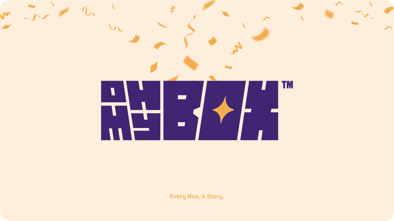
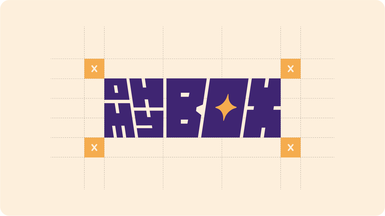
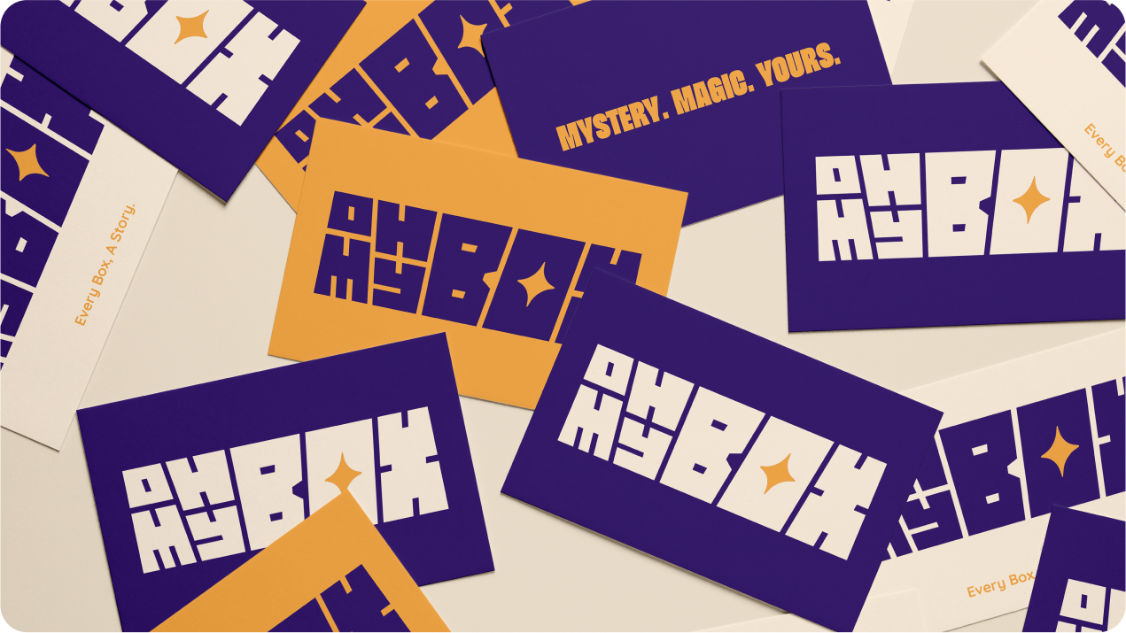
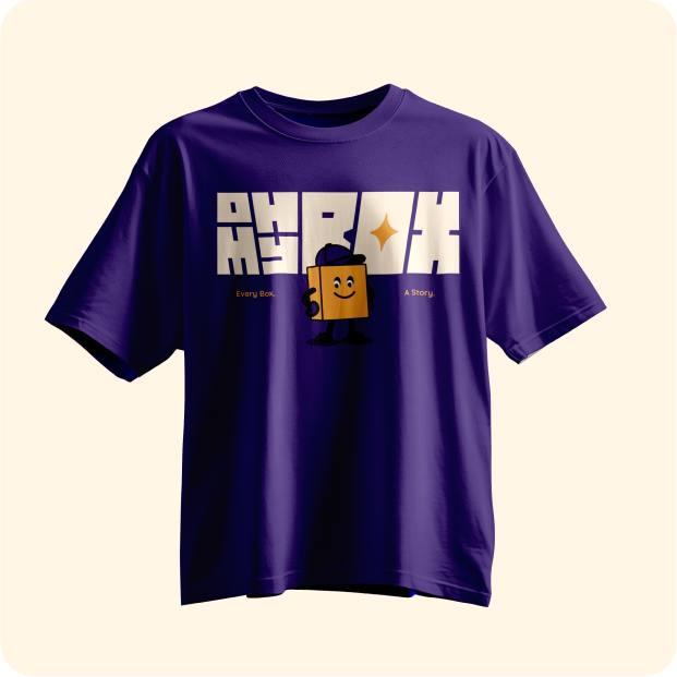
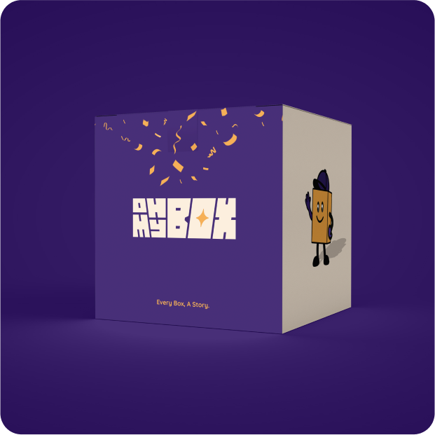
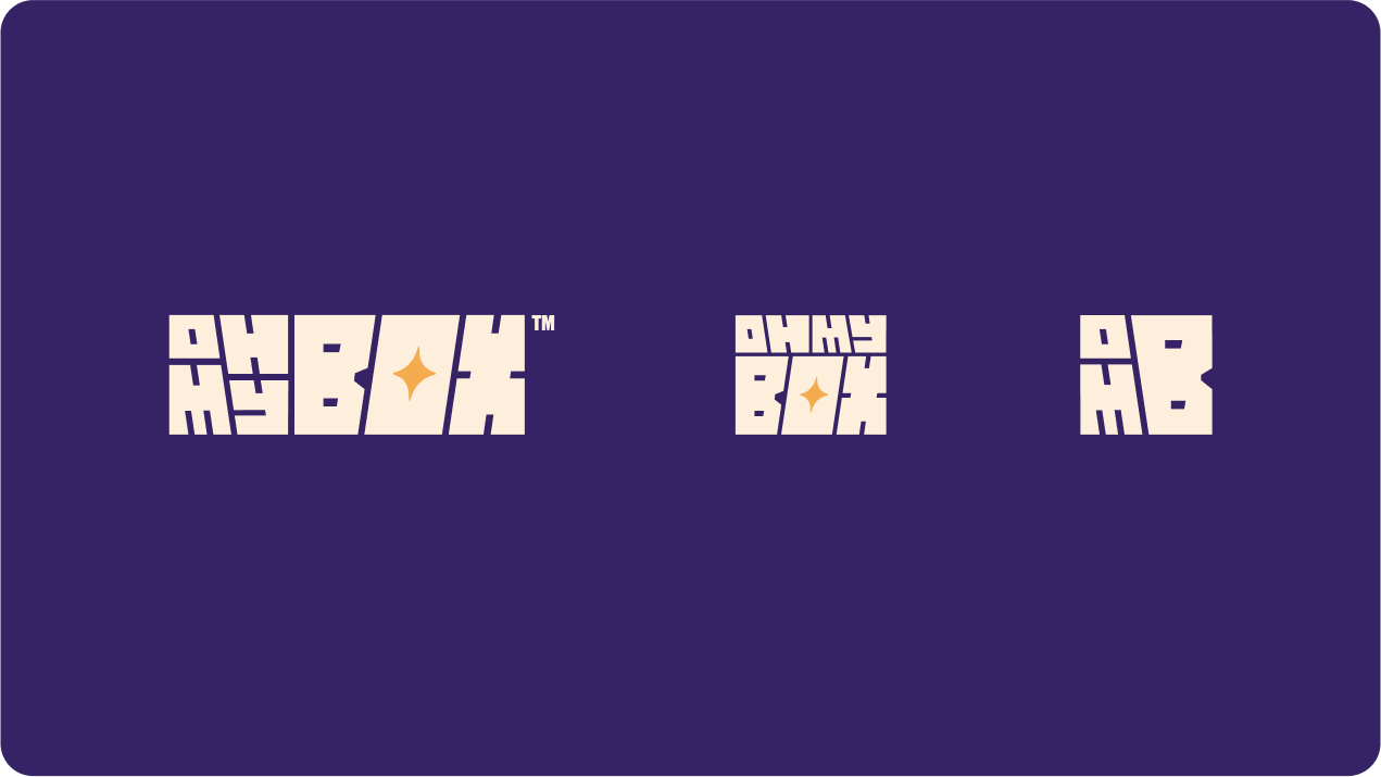
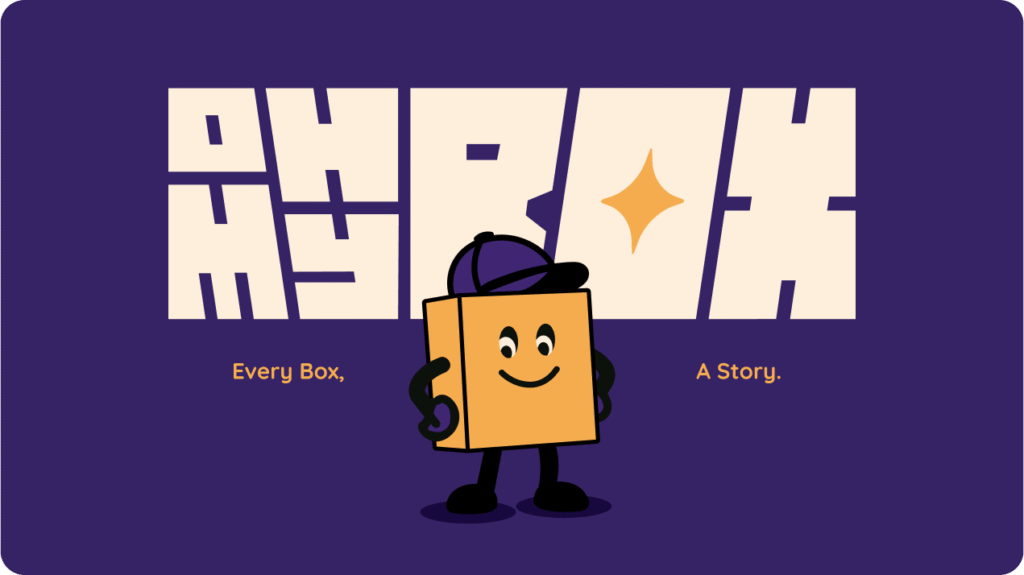
The OH MY BOX™ logo embodies the thrill of surprise and discovery. Its bold, boxy typography mirrors the shape of physical boxes, reinforcing the brand’s core offering. The starburst icon inside the “O” symbolizes magic, excitement, and the unknown — key emotions tied to the unboxing experience.
The vibrant purple and golden yellow palette strikes a balance between mystery and delight, while the clean, geometric form ensures high impact across packaging, digital, and merchandise. Designed to be playful yet confident, the logo reflects a brand built on curiosity, joy, and unexpected value.
Client Name:
Edward Richard
Service:
Brand Identity Design
year:
2025