Fuku Branding
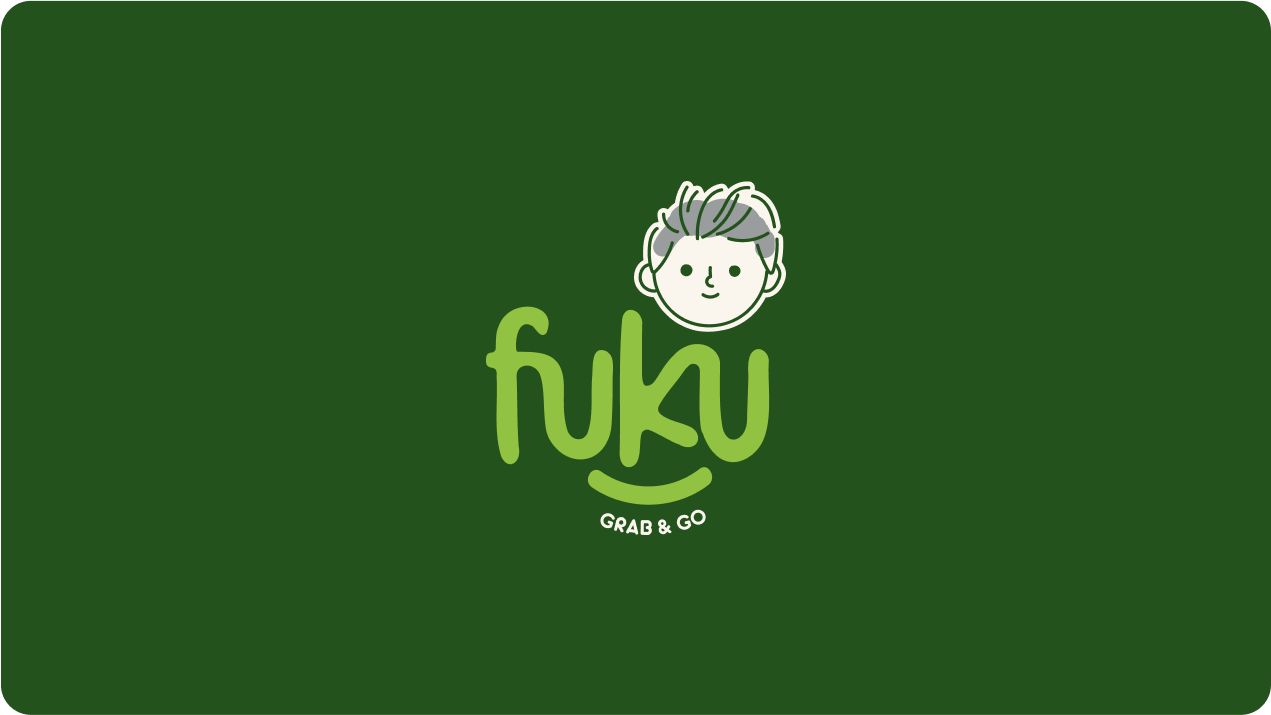
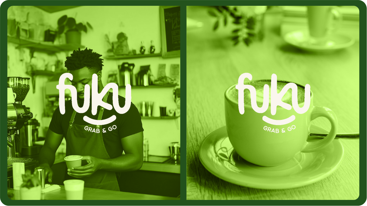
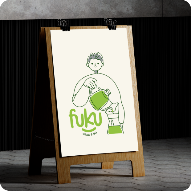
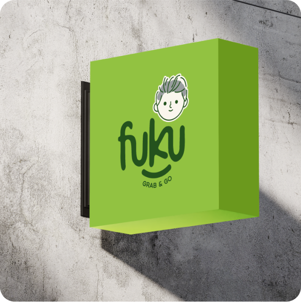
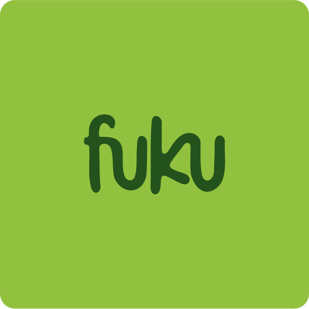
The core challenge was ensuring the brand name “FUKU” is read clearly and not misinterpreted as “FUK U.” To solve this, we created a playful and distinctive logo that guides the viewer’s reading naturally.
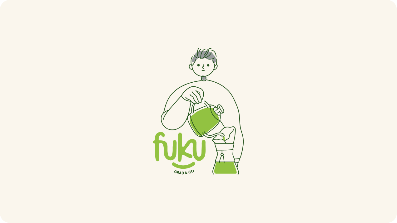
We introduced a smile element beneath the wordmark to evoke joy — a nod to the Japanese meaning of “Fuku” (福), which translates to happiness. To reinforce correct pronunciation, we subtly merged the ‘F’ with the ‘U’ and the ‘K’ with the final ‘U’, creating a cohesive visual flow that emphasizes the full name: FUKU.
The result is a logo that’s friendly, intentional, and unmistakably clear.
Client Name:
Edward Richard
Service:
Visual Identity
year:
2025